Web marketers love to throw around fancy terms like "bounce rates," "click funnels," and "traffic patterns." Sure, they matter, but let's get down to what counts – closing the deal.
Think of your website as a blockbuster movie and the shopping cart checkout is the grand finale. It's where a minor tweak can transform you from an underdog to a superstar in the ecommerce world.
We'll help you understand the most critical aspects of your shopping cart checkout and help you optimize your checkout flow for the best possible results.
Let's see the shopping cart checkout rules.
1. Make your shopping cart visible
The goal of an effective shopping cart is to make purchases effortless — even for the laziest shoppers on the planet.

When a shopper adds an item to their cart, they should easily find their way to the cart page. It's a crucial step. Online retailers often use popups that confirm the addition of an item to the cart, notifications that guide users to the cart's location (typically at the top right of the page), or animations that draw attention to the cart.
However, many online stores struggle with this seemingly simple task. It's important to remember that even minor disruptions in the checkout process can significantly impact your conversion rate, potentially resulting in lost revenue. We're not talking about most online shoppers here – we're referring to the one or two out of every hundred, who can collectively make up 2% of your annual revenue. Every little bit counts!
Mistake #1: Your visual cues don’t command attention. If your site’s color scheme is blue and white, your notification should be something that contrasts. There is a reason Facebook notifications are red.
Mistake #2: Your “check out now” area is hidden. When a visitor places an item into their cart, you will miss out by not inserting a CTA that nudges them toward the checkout page. Creating a popup showing cart contents and a “Pay now” option improves the checkout experience and conversion.
2. Navigate your customer to the cart
Once an item is in the cart, there are two routes you can take.
Notify visitors they have added an item to their cart and let them continue scrolling around your site. This is usually what most online retailers use. This is a good strategy if you have a multi-item business and customers who typically buy more than one type of item at a time. By not disrupting their shopping process, they can buy more products.
Pro tip: Adding a “Customers who bought this also liked: X, Y, Z” option could work well if you have complimentary products to upsell.
Guide users through the complex checkout process and avoid shopping cart abandonment. This works well for ecommerce businesses primarily selling a single type of product with a handful of feature variations. Online shoppers often prefer a streamlined experience, where they can quickly enter shipping addresses and select payment options without unnecessary steps.
By simplifying the cart and checkout process, you can reduce checkout abandonment rates and boost their online sales.
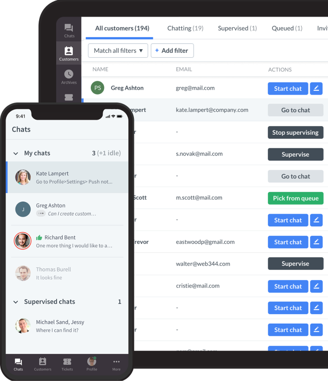
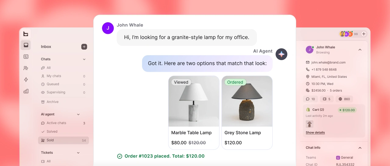
Connect with customers
LiveChat® is a complete customer service platform that delights your customers and fuels your sales.
Trusted by 36,000+ companies

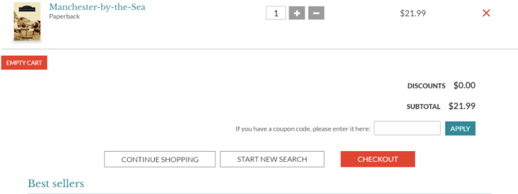
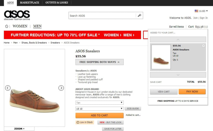
3. Cart contents and shipping costs
The default setting for indecision in ecommerce is cart abandonment.
As we move further along the checkout flow, simplicity becomes increasingly critical. When it comes to the items in your cart, two primary factors deserve your attention:
- Control: Make sure the checkout experience is smooth, and shoppers can easily adjust, add, or remove products from their cart.
- Visibility: Display items added to the cart, including a transparent view of the total cost.
The control factor is pretty straightforward. The slightest frustration about being unable to remove one item from the cart could cause customers to abandon the transaction altogether.
Shopping cart clarity means seeing an order summary on hand and being able to see everything, from the item and shipping costs to additional fees such as taxes and other pertinent information. 56% of online shoppers abandon their cart after they're presented with unexpected expenses. Once a shopper has decided to proceed beyond the first checkout step, they will become more hesitant to commit if the cost changes.

4. Make the purchase process easy
A clunky, multi-step payment page can be a conversion rate killer. Each additional step creates more barriers for potential customers, resulting in more questions, wasted time, and increased frustration.
Most online shoppers have autofill forms for their information, so it's wise to let them leverage this convenience. However, don't assume that a bulky one-page checkout is the solution either.
To optimize your checkout process, consider a streamlined approach with the following steps:
- Shipping information
- Payment option
- Review & confirmation
- "Thank You" page
This sequential flow builds customer commitment and maintains consistency throughout the process, much like Robert Cialdini's Principles of Influence. Adhering to these proven principles avoids overwhelming visitors with too many demands upfront. It also gives customers the subconscious satisfaction of completing each task, with their ultimate reward being the desired product. In return, you gain the prize of a delighted, paying customer.
Note: In 2022, over 15 million data records were lost or stolen online.
If there isn’t a 100% guarantee of security on your site from credible sources and safe payment methods, you can kiss most of your shoppers goodbye. Make this information prominent, and place it near the “Pay Now” button or next to areas where you ask for sensitive data.
5. Keep it simple on your checkout pages
Avoid overwhelming your customers on the checkout pages with unnecessary information, steps, or offers. Streamline the process to make it as straightforward and user-friendly as possible, reducing the risk of cart abandonment.
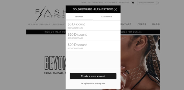
Certain online stores insist on having prospects sign up for a new account before they can complete their purchase. It might seem like putting the horse before the cart, but is it?
Giving users the option to create accounts on your website can be a game-changer for your business, but shockingly, many ecommerce sites need to catch up on this front.
Requiring visitors to register before making a purchase, or even pushing registration as a prerequisite for checking out, results in a whopping 25% of visitors abandoning the checkout process.
That seemingly innocent registration button? It's a quick ticket for them to head for the hills.
Building enduring relationships with your customers is the ultimate goal for every business. However, there are two paths to choose from: the right way and the wrong way.
The right way involves offering customers the opportunity to create a user account after completing their transaction. It's a smaller request, considering you've already gathered most of their information during the payment process. All that's needed is a simple request for permission to create the account, perhaps sweetened with an incentive like free shipping on their next order. It's a smooth, painless, and straightforward process.
Can you make your checkout page perfect?
To make your online store's checkout process top-notch, you must keep things simple and customer-focused. Whether you're starting from scratch or improving an existing system, picture how your customers complete their orders and aim to make it as smooth as possible. Make sure all parts of the checkout process flow seamlessly together.
Your main goal is to gather the necessary order details while removing any annoying distractions that might drive customers away from their carts. Along the way, consider encouraging future purchases by collecting email addresses, offering subscriptions, and making account creation effortless.
While striving for perfection is a worthy goal, achieving absolute perfection is incredibly challenging, if not impossible. However, you can continually optimize and improve your checkout page to make it as close to perfect as possible based on user feedback, industry best practices, and evolving technology.
Remember that it's an ongoing process of fine-tuning to find the checkout that works best for your ecommerce store.